
VesperStudiointerior architecture.
Eight projects, one page, no template grid. A portfolio concept for boutique interior architecture practices that need to prove calibre in seconds and convert taste into a serious enquiry.
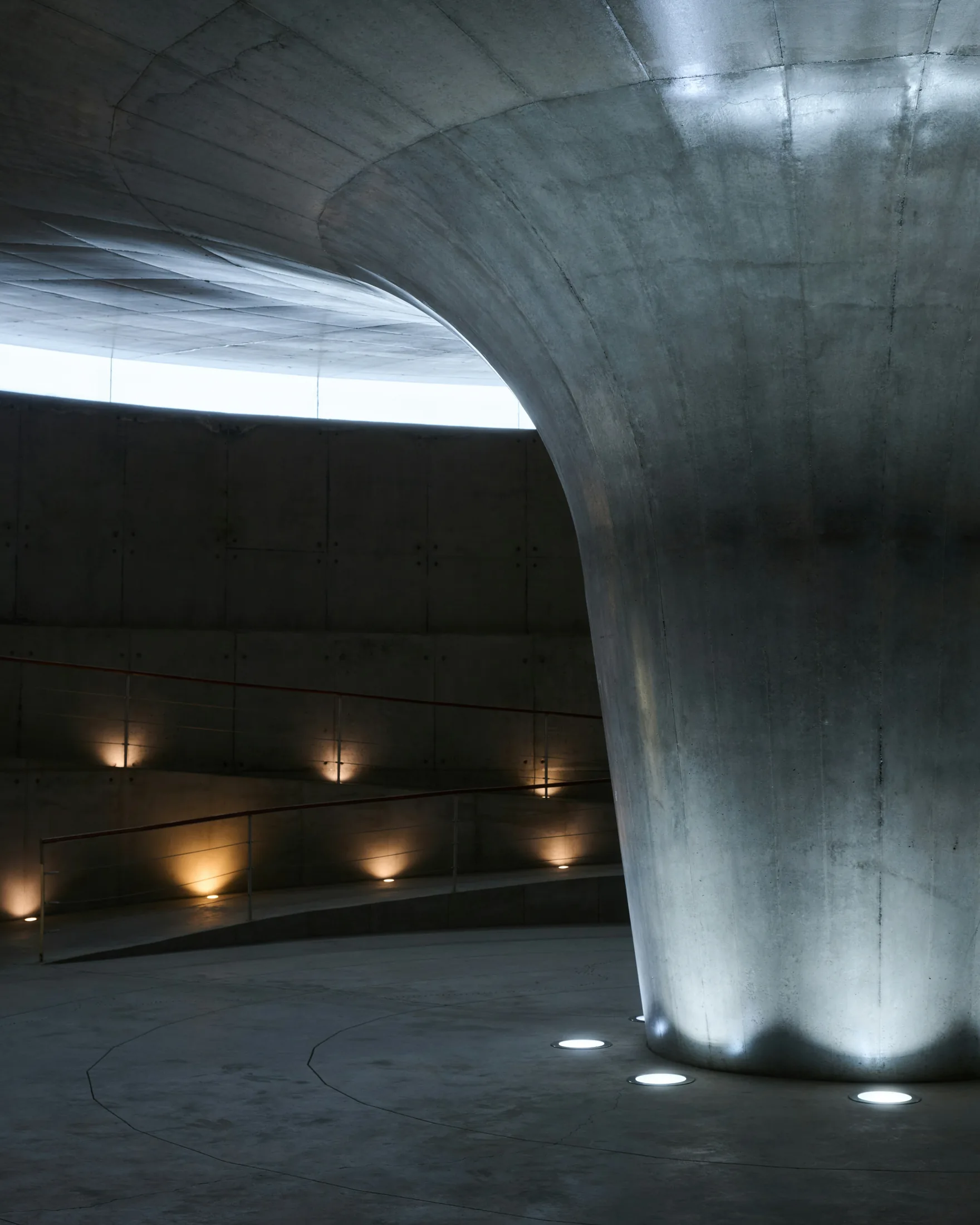
- Discipline
- Portfolio architecture
- Format
- Single-page concept
- Year
- 2026
- Build
- Static HTML / CSS / JS
Fictional concept built end to end by ClixFeed to demonstrate how a boutique interior practice can present spatial work without defaulting to an endless white grid.
Try the concept in a real browser.
This is a self-contained interactive prototype. Form submissions and bookings stay in-browser — they are not stored.Vesper Studio — live concept ↗
The work is visual. The decision is not.
Interior architecture studios face a specific website problem: the work is visual, high-consideration, and difficult to price from a homepage alone. Visitors arrive with taste already formed — they have saved images on Pinterest, walked through showrooms, and compared three practices before lunch.
- Default category behaviour is an endless white grid of unnamed projects.
- Contact forms treat a renovation enquiry like a newsletter signup.
- Most practices look identical, so the decision falls back on price.
Vesper Studio was created as a ClixFeed portfolio concept to show how a boutique practice might present spatial work online without defaulting to the industry's usual moves. The concept is a single-page, statically built site with filterable work, deep project modals, a cinematic walkthrough sequence, a spatial material library, and a front-end enquiry flow. It is designed to feel like a real studio — because that is the point — while remaining clearly labelled as fictional concept work.
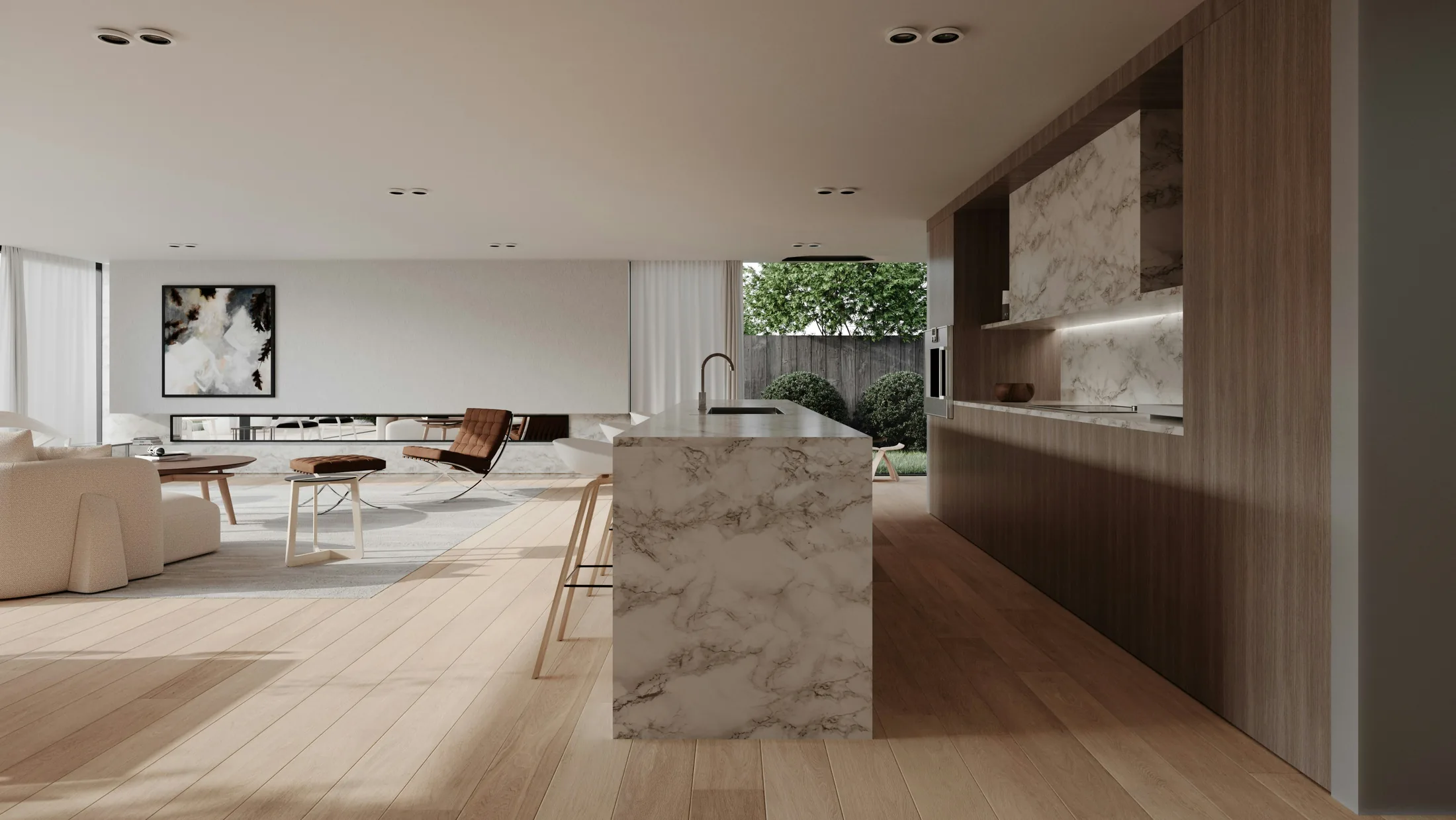
Four jobs, one system.
A portfolio site for this category must do four jobs at once. The concept treats them as one system, not a gallery plus a footer form.
- Prove calibre quickly — the visitor must sense project scale and craft without reading a manifesto.
- Help the right client self-select — residential versus commercial, full architecture versus styling-adjacent work.
- Create memorability — otherwise the practice becomes "one of those nice minimal studios."
- Convert interest into enquiry — without asking for a full brief upfront.
Nine sections, in decision order.
A disciplined one-page flow keeps narrative control. Navigation jumps to sections rather than spreading thin content across many URLs.
| # | Section | Role |
|---|---|---|
| 01 | Hero | Positioning, studio name, primary enquiry cue |
| 02 | Selected work | Filterable project grid with hover reveal |
| 03 | Project modals | Full-screen detail for each project |
| 04 | Walkthrough | Cinematic sequence — spatial pacing as brand signal |
| 05 | Spatial viewer | Drag-to-explore interaction with material hotspots |
| 06 | Crafted narratives | Accordion project stories for readers who want prose |
| 07 | Material library | Interactive swatches — craft credibility |
| 08 | Process | How engagements run — reduces "what happens next?" anxiety |
| 09 | Enquiry | Qualification-light form with success state |
Scroll orderIs this studio for me? → Is the work relevant? → Do I trust the process? → Can I start a conversation?
Tactile proof instead of stock photography.
A small, deliberately restrained library of materials the studio works with most often. Each swatch behaves like a craft credit — origin, finish, and a one-line note on why it earns its place in a project.
- Limewash plasterAndhra PradeshMatte · warm
Soft walls for south-facing rooms; takes pigment without losing breathability.
- Salvaged teakKerala · reclaimedBrushed oil
Reused structural timber, planed and resealed — never freshly milled.
- TadelaktMarrakechPolished plaster
For wet rooms; needs an experienced applicator and patient detailing.
- Brushed brassJamnagarHand-aged
Living finish — patina is part of the design, not a defect.
- Blackened steelPuneWax sealed
For joinery and stair rails; deepens in colour over time, not a flaw.
- HempcreteCoimbatoreRendered wall
Insulating, breathable, low-embodied-carbon infill for renovation work.
- Reeded glassFirozabadCast · 12 mm
For interior doors and partitions; takes light beautifully during the day.
- Lime pigmentRajasthanCustom palette
Mixed in studio — every wall is coloured in the same session as the spec.
Depth on demand.
Four choices carry the whole concept.
- Single-page architecture with anchored sections — interior studios often have limited service SKUs but deep project proof.
- Filterable grid instead of a category maze — eight projects are enough to demonstrate range if taxonomy is intentional.
- Depth on demand — the grid provides a fast scan; project modals and accordion narratives provide depth for serious prospects.
- Fictional but credible — no invented client quotes, award logos, or performance statistics.
Proof comes from project narrative, material detail, and visual consistency — the same constraint a real studio should respect when launching without a decade of published case studies.
Architecture-led and editorial.
Dark and light theme shifts, serif display paired with restrained sans, generous negative space, and photography treated as structural layout rather than background filler.
- Display — editorial serif, -0.045em tracking
- Grid — 12 column, generous negative space
- Motion — cinematic pacing, drag-to-explore
One action, four places.
Primary action: start an enquiry. The header, hero, and closing section all support the same action without competing CTAs.
- Qualification without intimidation — identity, project type, location, and a short scope note. Heavy briefing is deferred to human conversation.
- Trust through process visibility — a visible process section answers timeline and collaboration questions that otherwise become repetitive emails.
- Mobile as composition — layouts reorganise for smaller screens; project browsing and enquiry access stay reachable.
What this demonstrates for real clients.
For interior designers, architects, and spatial practices considering a portfolio rebuild.
Visitor mental models
Structure portfolio work by how clients search — property type, scope, style — not by how you file projects internally.
Depth mechanisms
Modals, accordions, and interactive detail that reward serious prospects without slowing the first scan.
Signature interactions
Motion that feels ownable — drag-to-explore, cinematic pacing — without breaking performance or accessibility.
Deploy-anywhere build
Plain HTML, CSS, and JavaScript with no framework dependency — practical for studios that want speed and maintainability.
Honest proof standards
No fabricated testimonials required to make the site feel complete — a real advantage at launch stage.
Editorial restraint
One page, one primary action, distinction without confusion.
A portfolio is not a gallery of everything you have ever built. It is an argument for the kind of work you want to be hired for next.
What this concept set out to demonstrate
That an interior practice can present eight projects with filtering, depth modals, material storytelling, and a clear enquiry path — without relying on fabricated client metrics or testimonials. It also proves editorial restraint: one page, one primary action, distinction without confusion.
- 01
- Primary action
- 08
- Projects structured
- 09
- Sections in flow
- 00
- Fake testimonials
Have a portfolio worth presenting properly?
Bring your project essentials — we'll come back with a recommendation, a scope outline, and a timeline.